

Logo
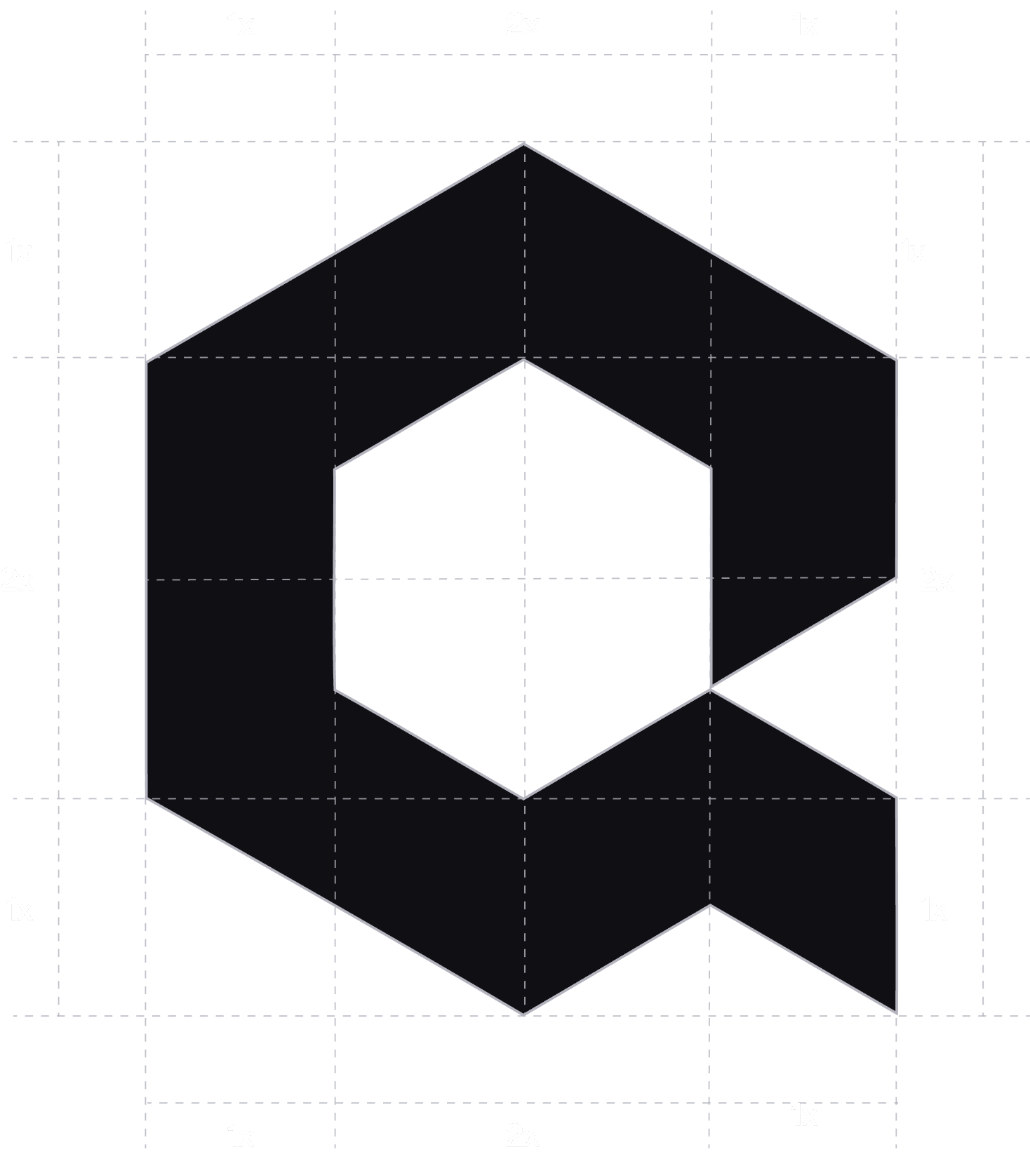
Icon & Wordmark


Icon

Wordmark
A refined typographic expression of the Quixel identity, designed for clarity and balance. Its distinctive form creates effortless recognition across every brand touchpoint. Use it consistently to maintain a strong and cohesive visual identity.

Logo Layouts
Different logo arrangements created to fit various layouts and brand applications. Each configuration maintains the same proportions, clarity, and visual balance. Choose the layout that best suits the space while keeping the identity consistent.


Protection Zone
Different logo arrangements created to fit various layouts and brand applications. Each configuration maintains the same proportions, clarity, and visual balance. Choose the layout that best suits the space while keeping the identity consistent.


Logo Misuse
Avoid altering, distorting, or rearranging the logo in any way. Always use the approved logo versions and maintain the correct proportions, spacing, and colors. These guidelines ensure the logo remains clear, consistent, and recognizable across all applications.
